


Air Quality Trends - How to Interpret the Graphs
The light blue blue band shows the distribution of air pollution levels among the trend sites, displaying the middle 80 percent. The thick blue line represents the national median among the sites included in the chart. Ninety percent of sites have concentrations below the top line, while ten percent of sites have concentrations below the bottom line.
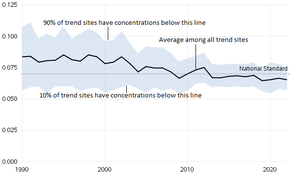
For each pollutant, the trend statistic is directly related to the averaging time, form, and level of the National Ambient Air Quality Standards (NAAQS). For more information regarding the levels and averaging times for the NAAQS statistics, see the NAAQS Table.