Real Time Geospatial (RETIGO) Tutorials
RETIGO is a free, web-based tool that shows air quality data that you've collected while you are stationary or in motion (walking, biking, or on a vehicle). In addition to viewing your data, RETIGO allows you to view data from nearby air quality and meteorological stations.
This page contains both video and interactive tutorials on RETIGO basics: preparing and loading a data file, navigating the interface, and using the data repository. The videos were developed for a previous version of RETIGO, however the majority of the content is relevant for the current version. The written tutorial has been updated to reflect the most current version of RETIGO.
Video tutorials
These video tutorials will show you how to use the features of RETIGO. The videos include voice narration and closed captioning.
Online Tutorial
- Step 1: Prepare a Data File
- Step 2: Load Data or Select from Data Repository
- Step 3: View the Data
- Step 4: Investigate the Data
- Step 5: Merging in other data
Step 1: Prepare a Data File
You can load a data file directly from RETIGO's data repository, or prepare a file using your own data. If you want to use the data repository, proceed to step 2.
RETIGO reads plain text data files, which can be either space or comma delimited. Here is an example of what a RETIGO data file should look like. Two complete example files can be downloaded below.
## Sampling day: July 18 2012
## Operator: Jane Doe
## Location: Raleigh NC
## Notes: Weather is clear, light traffic
Timestamp(UTC),EAST_LONGITUDE(deg),NORTH_LATITUDE(deg),ID(-),ozone(ppb),pm2.5(ug/m^3)
2012-07-18T15:44:00-00:00,-78.9979,35.9508,route1,49.0491,32.6768
2012-07-18T15:44:19-00:00,-78.9947,35.9470,route1,43.2706,26.7231
2012-07-18T15:44:57-00:00,-78.9896,35.9361,route1,42.3130,34.1504
2012-07-18T15:45:58-00:00,-78.9846,35.9172,route1,47.7046,33.2918
2012-07-18T15:46:17-00:00,-78.9733,35.9048,route1,48.3285,-9999
[etc...]
The first four lines in the example are comment lines (denoted by two hash symbols: ##). Comment lines can occur anywhere in the file, and can be used to make whatever annotations you wish. There is no limit to the number of comment lines allowed since they are completely ignored by the RETIGO program.
The next line is the header line, which identifies each column of data. The first four columns must be present in every file in the order listed in the example. They describe the time and position of each measurement, along with an identifier which can be used to sort the data when it is being analyzed. There should be at least one additional column that contains measurement data, and there can be up to ten such columns. The variable names should not include spaces. It is also suggested that units be included in the variable name. The exact format of each column is as follows:
| Column 1: | Timestamp that conforms to the UTC/ISO 8601 international standard.
For example, 2012-07-18T15:44:00-00:00 corresponds to July 18, 2012, 3:44:00pm Greenwich Mean Time (GMT). The exact same instant of time could be represented in different US timezones as:
* Extra precision: For many users, the specification of time to the nearest second will be adequate. However, it is possible to add two decimal places of precision (hundredths of a second) by using a timestamp of the form YYYY-MM-DDThh:mm:ss.ssTZD |
|---|---|
| Column 2: | East longitude in decimal degrees. |
| Column 3: | North latitude in decimal degrees. |
| Column 4: | Identifier string. |
| Column 5+: | Measurement data, with data descriptor and units in the header. |
At least one column of measurement data is required, but there can be additional data columns if desired. In the example above, two data columns are included (ozone and pm2.5). Use -9999 to indicate missing variable data.
To get started, you may want to download this sample file and proceed to the Step 2. You can also view a separate tutorial on how to create a RETIGO file from an Excel spreadsheet.
Sample concentration data: MobileData_RETIGO.csv (csv)
This data is related to the recent publication "On-road black carbon instrument intercomparison and aerosol characteristics by driving environment," A.L. Holder et al., Atmos. Environ., 88 (2014), pp. 183-191. https://doi.org/10.1016/j.atmosenv.2014.01.021.
Wind Data
Wind data can be included as separate vector components (magnitude and direction). In general, the wind data can have different temporal and spatial sampling than the pollution data. However, to create pollution rose plots, the wind data needs to be collected at the same time and location as the measurement data. The format of wind data is similar to that of the regular RETIGO data file outlined above. However, since wind is a vector quantity, both the magnitude and direction must be specified. For example:
Timestamp(UTC),EAST_LONGITUDE(deg),NORTH_LATITUDE(deg),ID(-),wind_magnitude(m/s),wind_direction(deg)
2008-11-05T07:14:00-05:00,-78.6140,35.8229,Sonic_anemometer,2.1532,0.0
2008-11-05T07:14:05-05:00,-78.6140,35.8229,Sonic_anemometer,2.1998,45.0
2008-11-05T07:14:10-05:00,-78.6140,35.8229,Sonic_anemometer,2.6970,90.0
[etc...]
The units of the wind magnitude can be defined by the user (e.g. m/s, mi/hr), but the direction must be in degrees using the standard meteorological convention: the heading indicates the direction from which the wind originates (clockwise from North). A heading of 0 degrees indicates wind coming from the North, 90 degrees indicates wind from the East, etc.
RETIGO displays the wind in a vector sense, where the tip of the arrow points in the direction the wind is going. So a wind direction of 90 degrees specified in the file (from the East) would be pointing toward the West in the visualization.
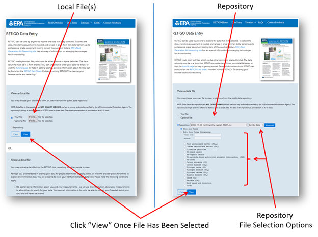
Step 2: Load Data or Select from Data Repository
Once you have a data file to view, go to the RETIGO application page and select a file to view from your local filesystem. If you have a second file pertaining to the same time period (e.g., from a second measurement system), you can include it as an optional second file. At this time, the application can only accept a maximum of two data files. If you do not have a file of your own to view, you can select a file from RETIGO's data repository. Once you have selected your options, click the View button to load the data and begin viewing it.
Step 3: View the Data
After you click the View button, your data will be loaded into the browser and displayed on both a map and a timeseries plot as shown in Figure 2. The colors indicate the value of the selected variable, ranging from dark blue (low) to red (high) by default. RETIGO automatically determines the lowest and highest values of the selected variable and adjusts the color scale accordingly. You can also customize the colorbar by setting the minimum and maximum values for each variable.
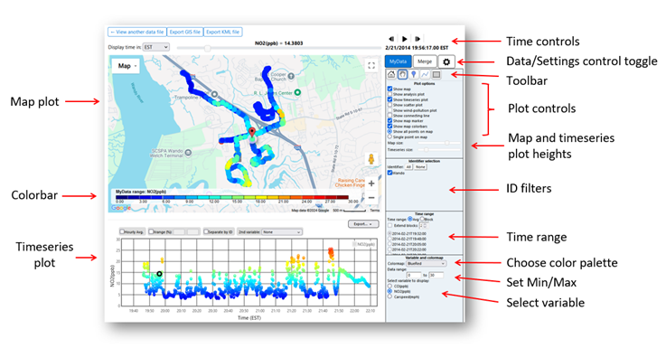
Data Control Toggle
The Data/Settings control toggle allows you to change menus to perform different tasks. The following is a brief overview of the menu selections. The options that you can select in each menu will be discussed in greater detail later in this tutorial.
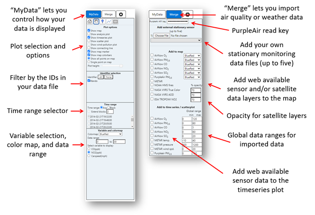
- “MyData” (Figure 3) is for choosing options pertaining to the data file that you loaded in Step 2.
- When the Data Control Toggle is set to "MyData", you are presented with controls that allow you to choose how to display your data. You may choose to view several types of plots, including the map and timeseries that are shown by default, by selecting or de-selecting the box next to each option.
- Other available options allow you to view the data as a function of distance from a selected point or polyline, a scatterplot, and/or a wind-pollution plot.
- In addition, you can choose which variable to display, select the data range and colormap (palette), and choose between a time averaged overview of your data or short segments of full time resolved data.
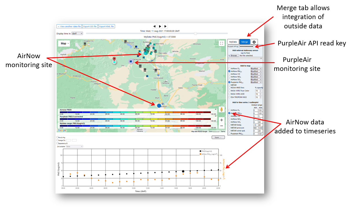
- “Merge” (Figure 3) is for bringing in supporting web-accessible data that was collected independently of your data.
- When the Data Control Toggle is set to "Merge", the menu options change to allow you to bring in relevant air quality data from various sources including the AirNow network, PurpleAir, the World Meteorological Organization Global Surface Meteorology Monitoring Network, and various satellite data products.
- To access PurpleAir data, you must supply an API read key, which you can request for free from PurpleAir, Inc.
- You can also load your own stationary monitoring data from a file (up to 5).
- If you choose to show web-available monitoring data such as AirNow, RETIGO will automatically retrieve the data if it is available and display it alongside your measurements. The data retrieval may take a minute or two depending upon the time and spatial extent of your dataset.
- “Settings" (gear icon) (Figure 4) is for selecting certain options for how plots are presented.
- When the Data Control Toggle is set to "Settings", the menu options allow you to choose the font size for the control panel and plot options for the various supporting plot types (timeseries, scatterplot, etc.).
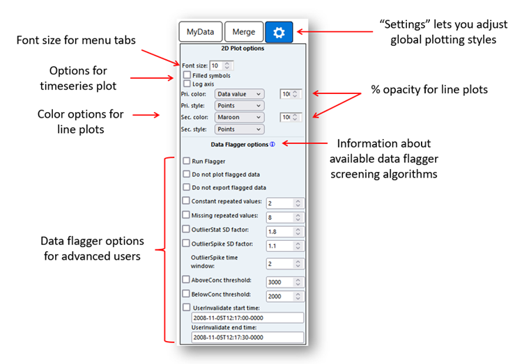
More information about how to use the data flagger is given in Step 4 below.
Select Variable
All the measured variable names (in column 5 and beyond in the data file) are shown in the "select variable" area. Simply click the radio button next to the variable that you would like to see. RETIGO will automatically show the data on the map and update the colorbar accordingly. You can also select which colormap to use and adjust the range of the variable by entering minimum and maximum values into the appropriate text boxes. The data range will apply to the map and to all supporting plots (timeseries, etc.).
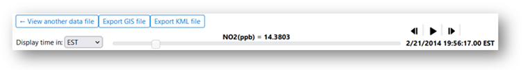
Time control
The time control is a horizontal slider (Figure 5) near the top of the application that is used to pinpoint a particular data sample in time. The selected time is shown above the slider, referenced to the desired timezone. The corresponding data value is shown below the slider. Dragging the slider allows you to track the dataset over time. You can also use the animation controls to animate or single-step through time.
Toolbar
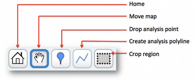
The toolbar (Figure 6) allows you to interact with the map in various ways:
- The "home" button automatically centers the map around your data, and sets the optimal zoom level to show the entire dataset.
- The "move map" button lets you recenter the map. With the "move map" icon selected, simply left-click anywhere in the map and drag the mouse while keeping the left mouse button down. Once the map is in the desired position, let go of the mouse button.
- The "drop analysis point" function lets you designate a point on the map, denoted by a pushpin. You can then plot your data as a function of distance from the point (see below). This might be useful if you know the location of a pollutant source. To designate a point, select the icon and then left-click anywhere on the map. A pushpin will appear to mark the selected point. The pushpin can be dragged to a new location by simply left-clicking on it, moving it to a new location, and letting go of the mouse button. To delete the pushpin, right click on it.
- The "create analysis polyline" function is similar to the analysis point, except you create a polyline instead of a point. Left-click to create the starting point, and then again to create the ending point. The polyline can be modified into any shape by clicking on the center of the line and displacing it, creating two new line segments each with a new center. By repeatedly adjusting the location of the centers, the polyline can take on any shape. For example, the polyline could be made to approximate the contour of a road. To delete the polyline, right click on it.
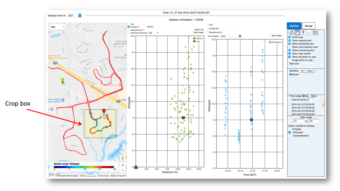
- The "crop region" function lets you exclude all data outside of the defined box. With the crop region icon selected, simply left click and drag on the map to define the region of interest. Any analysis plots that are active (see below) will automatically update to reflect the selection. To delete the crop region, right click on it.
Step 4: Investigate the Data
RETIGO provides a few simple ways to investigate your data:
- Plot data as a function of time
- Plot data vs. distance from a point
- Plot data vs. minimum distance from a polyline
- Plot data in a polar wind-pollution format
- Plot one variable versus another in a scatterplot
You can turn the supporting plots on and off using the checkboxes underneath the toolbar. It is possible to have any combination of the map, timeseries plot, analysis plot, wind-pollution plot, and scatterplot active at once.
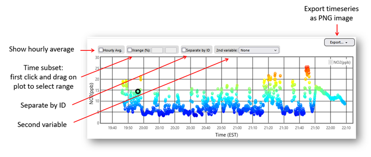
Timeseries Plot
The timeseries plot (Figure 7) shows the selected variable as a function of time. As you move the time control slider, the corresponding datapoint is highlighted in the timeseries plot with a black circle. You can also add a second variable to the plot, which will be shown with a black triangle and will correspond to a new y-axis on the right. You can zoom into a smaller portion of the time series by using your mouse to click and drag around the area of interest in the horizontal direction. Checking the “hourly average” option may be handy for comparing your data to AirNow and other monitoring data that are on an hourly timebase.
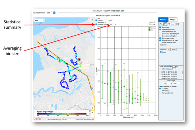
The analysis plot (Figure 8) shows the selected variable as a function of distance from the designated analysis marker (point or polyline). The analysis markers can be used to investigate how your data varies with distance from certain known locations, such as a point emission source, a roadway, or a line of wildfires. See the “Toolbar” controls section above to learn how to designate analysis points or polylines. As you move the time control slider, the corresponding datapoint is highlighted in the analysis plot with a black circle (marker) or triangle (polyline).
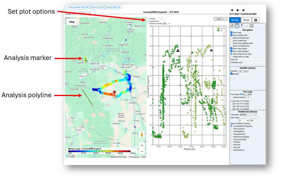
You can also choose to aggregate the data into bins of a designated size; the mean and standard deviation are automatically computed and displayed (Figure 9).
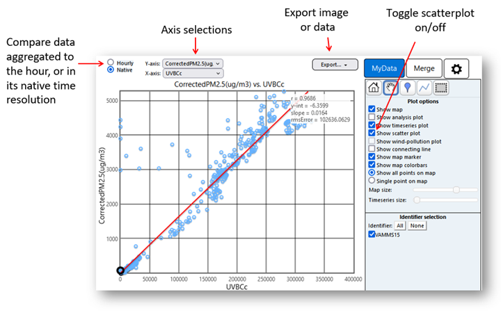
Scatterplot
The scatterplot is used for plotting one source of data versus another (Figure 10). This can be useful for investigating correlations between differing data variables or for comparing like variables separated in space. The two main plotting modes are hourly and native time resolution. In the hourly mode, your data is aggregated/averaged to the hour (if it is not already), which allows you to compare your data to established monitors such as AirNow and PurpleAir, both of which are available as hourly averages. In native time resolution mode, you can compare two different variables from your dataset against each other at the same time resolution provided in your dataset.
In either case, you can choose any of the variables from your dataset, as well as any merged variables. First, choose the plotting mode (hourly or native). Then use the drop-down menus to choose which variable to plot on the X and Y axes. Only the variables available at your chosen time resolution will be available in the menus (i.e. if you choose the hourly mode, all hourly averaged data are included in the menu list). This ensures that each point on the scatterplot is time matched and represents a similar time average. Summary statistics are automatically computed, including the correlation coefficient, the y-intercept and slope of the regression line, and the root-mean-square (rms) error.
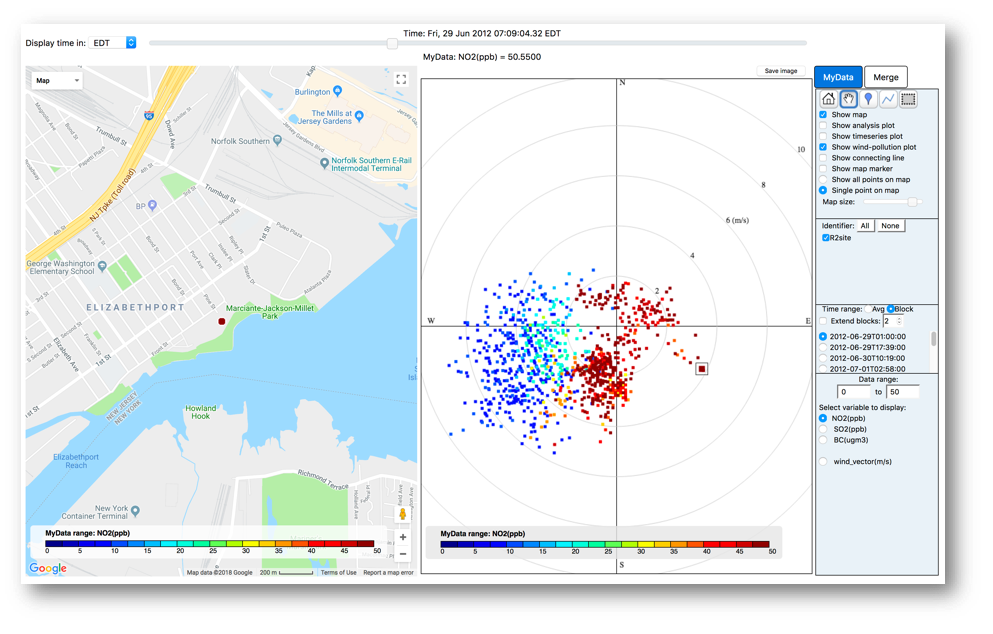
Wind-Pollution Plot
If wind vector data is present in your data, you can view a wind-pollution plot for the selected variable (Figure 11). This is a polar plot, where the angle is equal to the wind heading, the distance from the center is equal to the wind magnitude, and the color corresponds to the value of the selected variable. For example, the marker located within the square on the image below represents a measurement that occurred when the wind was from the southeast, with an approximate wind speed of 4 m/s, and the color can be matched to the colorbar representing the pollution concentration range, in this case about 50 ppb. The wind-pollution plot is best suited for stationary data.
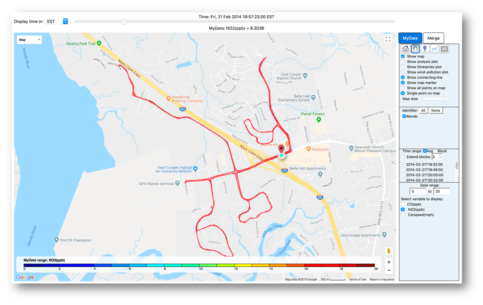
Show Connecting Line
This option connects your data with a red line to better visualize the path that was taken during the data collection. It is useful if you are viewing data in "single point" mode (Figure 12).
Crop Region
Use the crop region function to exclude data outside of a region of interest (Figure 13). After clicking on the crop region icon, simply left click and drag on the map to define the region. When the mouse button is released the map and analysis plots will automatically be updated. The crop box can be deleted by right-clicking anywhere inside it.
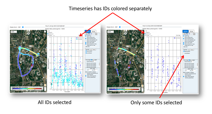
Using IDs
The RETIGO file specification allows you to tag each data point with an identifier (ID), which is composed of alphanumeric characters. You can use the IDs to group your data in any way you like, and isolate them in the visualization (Figure 14).
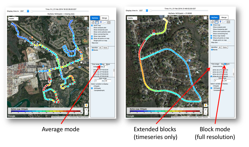
Time Mode / Large File Support
For efficiency, RETIGO only shows 1,000 points at a time. If your dataset contains more points, say 100,000, you can look at the dataset in one of two ways (Figure 15).
- Using average mode (default), the data is time averaged into bins, such that there will be approximately 1,000 bins. In this example, every 100 points would be time-averaged, yielding 1,000 points to be shown on the map.
- If you want to see your un-averaged data, select block mode. Here, the data can be accessed 1,000 points at a time in blocks. The starting time of each block is listed in the menu. You can click through the list of blocks one by one to view the entire dataset. There is no limit to the number of data points that your dataset may have; larger files will simply have more blocks. If you are using the timeseries plot, you can extend the range by clicking "Extend blocks" and selecting the number of additional blocks to view (up to five).
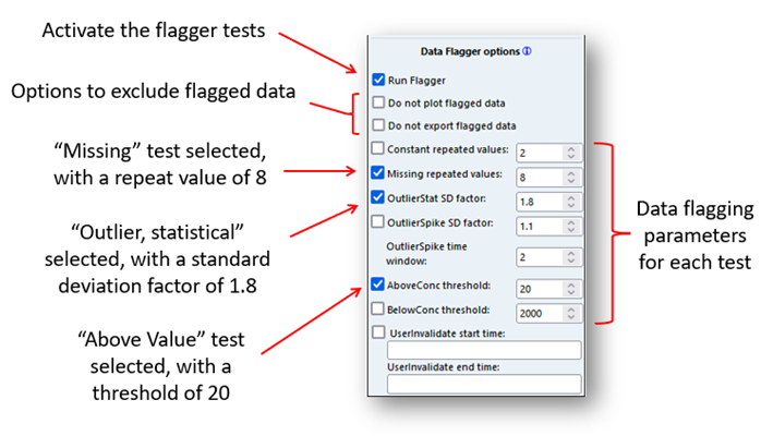
Data Flagger
RETIGO provides several algorithms that will screen your data and alert you to some common problems that might be present by flagging suspect data points. In addition, you can choose to exclude flagged data from the various plots, calculations, and/or exported data. The data flagging feature is provided for advanced RETIGO users, and it is the responsibility of the user to assess the flagged data to determine if there is a problem. The data flagging algorithms are data agnostic and are provided as a convenience; they do not constitute a complete and robust quality assurance (QA) process.
The data flagging algorithms include:
- Constant: This test fails if there are N or more sequential readings with the same value. The parameter N is set by the user.
- Missing: This test fails if there are N or more sequential readings with missing data (indicated by -9999). The parameter N is set by the user. If a timestamp is not part of the user-supplied data file, the section will not be flagged using this test.
- Outlier, Statistical: This test calculates how far each point is away from the average and compares it with the standard deviation of all valid readings. A data point is considered an outlier if its value is more than a factor of N standard deviations from the mean. The parameter N is set by the user.
- Outlier, Spike: For each data point, this test calculates the standard deviation of readings over a user-defined time window with N hours centered at the point. The "N hours" parameter can be set by the user. If the absolute difference between the data point and the previous data point is more than a factor of M standard deviations from the mean of the datapoints within the time window, and the change between the next reading and the current reading is also more than a factor of M standard deviations from the mean in the opposite direction, the current reading is considered an outlier.
- Above Value: This test fails if a data point is above the threshold set by the user.
- Below Value: This test fails if a data point is below the threshold set by the user.
- User Invalidated: This test flags all data points that fall within a time window prescribed by the user using the format YYYY-MM-DDThh:mm:ssTZD. See “Step 1: Prepare a Data File” for more information about the UTC/ISO 8601 timestamp format.
To use the data flagger, you must select the "Run Flagger" option in the Settings along with any tests that you wish to use. By default, all tests are turned off. Be sure to set the parameters for each test appropriately for your data. In the example below, the "Missing (N=8), "Outlier, statistical (N=1.8)", and "Above Value (value=20)" tests are performed.
The flagger results are best viewed in the timeseries plot. All flagged data points are highlighted by vertical gray bars, with specific colors used to show which of the selected tests failed. The vertical locations of the color markers within the gray bars are not important; the markers simply allow you to understand why the associated data point(s) are flagged. It is possible for a single data point to be flagged by multiple tests, which is why the color indicators are separated from each other vertically.

Clicking "Do not plot flagged data" removes the flagged point from the timeseries and all other plots:

Likewise, clicking "Do not export flagged data" will exclude any flagged data from the exported data file. If the flagger is active and this option is not checked, flagged data will be included in the exported data file, but with associated metadata indicating that the data was flagged by certain tests.
Other Features
The map display is a fully functioning Google Map™ display (Figure 19).
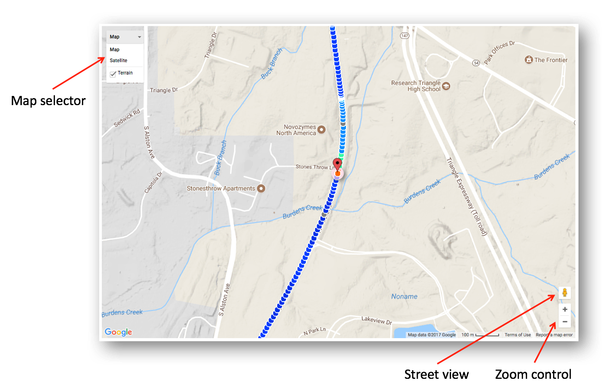
The map selector lets you switch between a regular roadmap, a terrain map, or a satellite view. The zoom control allows you to zoom in or out using the slider or the plus and minus buttons at the top and bottom of the slider. Sometimes the terrain view limits the zoom level, so you may need to choose a different map if you want to zoom all the way in.
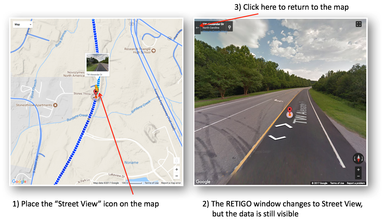
To use Google Street View™, left-click on the Street View icon and drag it to your location of interest on the map. Everywhere that Street View is available will be highlighted in blue. When you let go of the mouse, the RETIGO view will automatically change to Street View (Figure 20). The view can be rotated and navigated using the mouse. To return to the main map, click the "x" in the upper right hand corner.
Note: The satellite map and Street View images are collected at different times (sometimes months or years apart), but both are updated periodically by Google, Inc. Both may not reflect the exact conditions present at the time of your data collection, so care must be taken when interpreting the imagery.
Step 5: Merging in Other Data
Click on the Merge tab to add data to either the map or timeseries plot. You can add data from ground based in-situ point sources such as AirNow, PurpleAir, and weather monitors. In addition, you can add satellite-derived data sources pertaining to smoke and aerosols throughout the air column.
Point sources
You can add various point data to the map or timeseries, including AirNow monitoring sites (shown as circles), PurpleAir sensors (shown as squares), and weather monitoring (METAR) sites (shown as custom glyphs). When you select each data source, RETIGO will automatically pull in data for the same location and time period as your data, if it is available. You may have to zoom out the map in order to see the additional sites on the map. To access PurpleAir data, you must first obtain an API read key from PurpleAir, Inc. and enter it in the appropriate box on the Merge tab.
When AirNow, PurpleAir, or METAR data are added to the timeseries plot, the added data uses a separate y-axis and data range (Figure 21). When comparing to your data, be sure to adjust the data ranges accordingly.
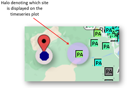
If you are plotting AirNow, PurpleAir, or METAR data on the timeseries, its corresponding site on the map will have a halo around it (Figure 22). You can select a different site by clicking the site’s icon on the map. In addition, you can hover the mouse over any map icon to see its data value corresponding to the selected time.
Satellite-derived data
You can add satellite-derived data only to the map. The available sources include:
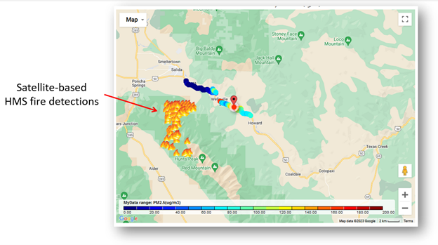
- Fire detections from the Hazard Mapping System (HMS), shown as fire icons (Figure 23).
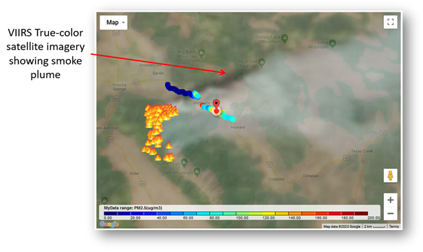
- True color imagery from NASA’s Visible Infrared Imaging Radiometer suite (VIIRS) (Figure 24).
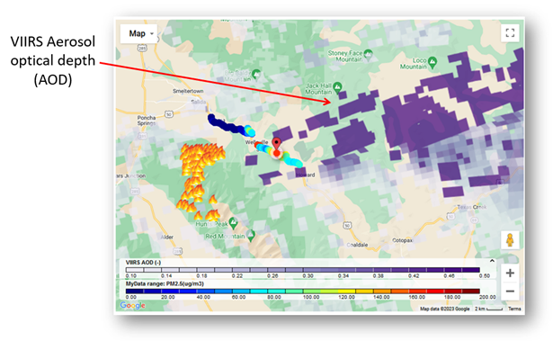
- VIIRS aerosol optical depth (AOD). Higher values indicate more aerosols in the integrated vertical air column (Figure 25).
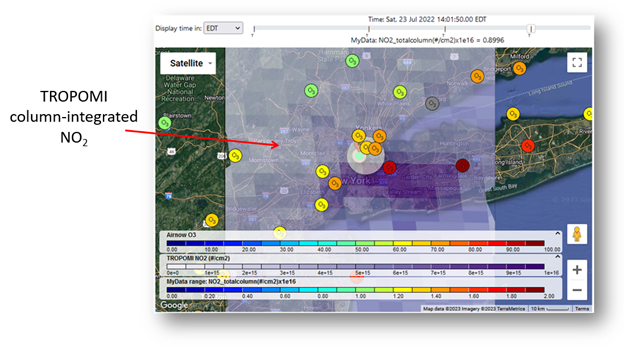
- Column integrated nitrogen dioxide (NO2) from the European Space Agency’s TROPOspheric Monitoring Instrument (TROPOMI) (Figure 26).
Following are examples of satellite data products added to the map (via the Merge tab) that help characterize the location of a wildfire and the downwind transport of the associated smoke plume.