
Power Plants and Neighboring Communities
The following sections are presented below:
Overview
Burning fossil fuels at power plants creates emissions of sulfur dioxide (SO2), nitrogen oxides (NOX), particulate matter (PM), carbon dioxide (CO2), mercury (Hg), and other pollutants. These emissions can have serious health and environmental impacts.
Over the past two decades, the power sector has significantly reduced many of these pollutants, but important health and environmental concerns remain. The Power Plants and Neighboring Community Mapping Tool and associated data helps identify and characterize the communities that may be exposed to air pollution from power plants. The tool offers several methods to identify these communities, from those in the immediate vicinity of the plants, to those that are farther downwind. To help characterize the communities that are potentially exposed to power plant emissions, the tool displays various socioeconomic data from the U.S. Census Bureau and EPA that may include race/ethnicity, income, age, language, and education. The tool does not, however, evaluate air quality impacts or quantify the potential health risk to those populations.
Mapping Power Plants and Neighboring Communities
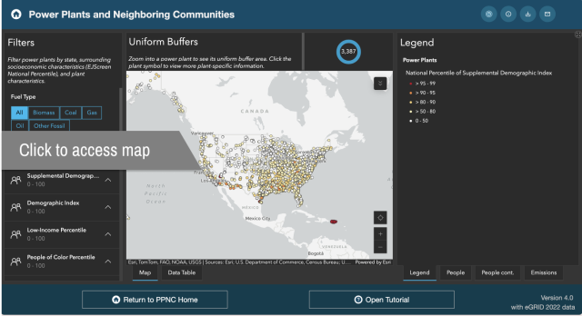
The Power Plants and Neighboring Communities Mapping Tool identifies the locations of power plants and provides socioeconomic indicators of communities near or downwind of those plants. The map displays all power plants that burn fossil fuels, have generators at least 1 MW in nameplate capacity, and supply electricity to the grid.
Users can filter the plants displayed in the mapping tool based on plant characteristics such as size and fuel type, quantity of annual plant-level emissions of SO2, NOX, CO2, and PM2.5, and socioeconomic indicators that characterize the near and downwind communities.
There are additional layers that can be toggled on or off, such as power plant emissions, socioeconomic indicators at the census block group level, and tribal lands.
Some layers may not be visible until the map is zoomed in to show a smaller region. When you select a power plant marker, a small window opens and displays plant data such as emissions, generation, fuel type, and socioeconomic indicators for the communities near or downwind of the plant.
To access the Power Plants and Neighboring Communities Mapping Tool, click the image below.
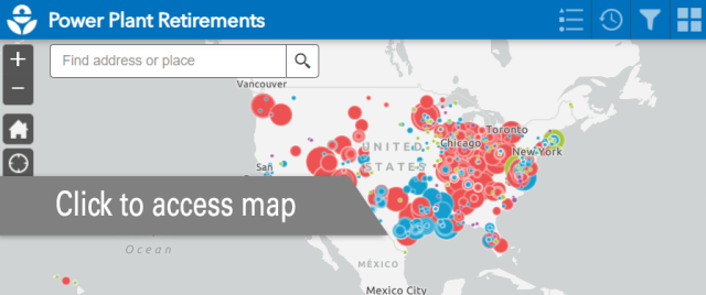
Mapping Power Plant Retirements
Many power plants that burn fossil fuels, especially those that burn coal, have announced plans to retire. This electricity generation may shift to other power plants that burn coal or natural gas, or to renewable energy sources such as wind and solar.
The interactive map linked below shows recent and announced retirements of power plants that burn coal, natural gas, oil, and other fossil fuels.
To access the Power Plant Retirements Map, click the image below.
Data Considerations
The impacts of power plant emissions are not limited to the area immediately adjacent to a plant. Because air pollution can travel over long distances, the impacts of power plant emissions can be felt locally as well as many miles away, meaning that the air quality in a community can be impacted by far-distant sources as well as those sited near a community. For more information about downwind communities potentially affected by power plant emissions, refer to the Plant-Specific Buffers view or Long-Range Downwind Areas View of the Power Plants and Neighboring Communities Mapping Tool.